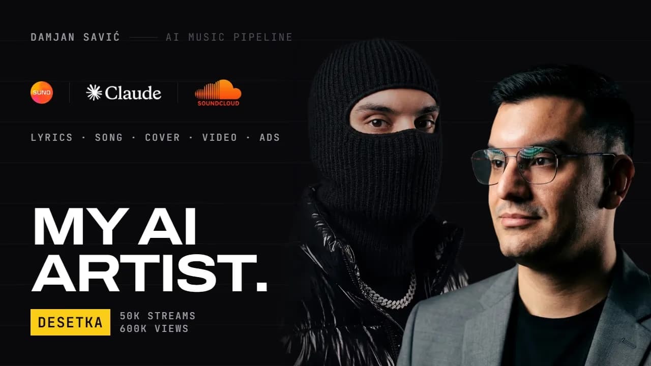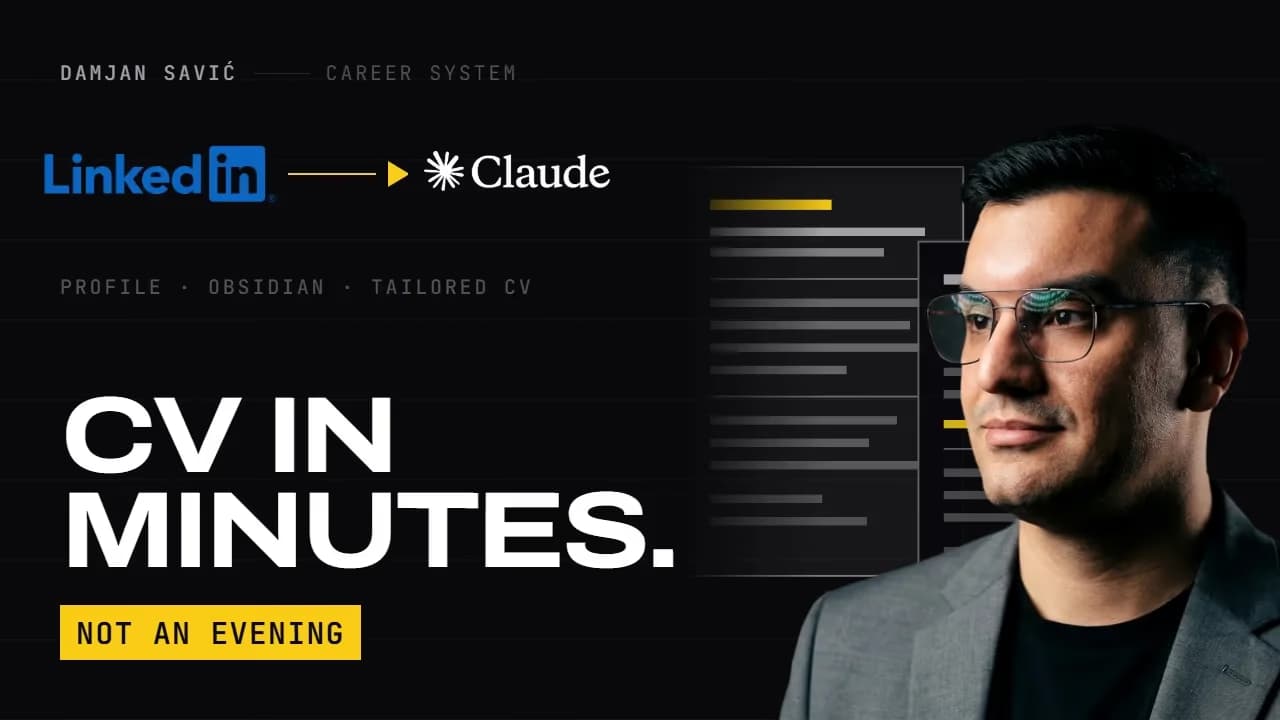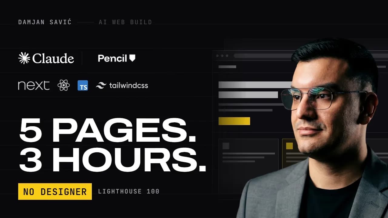
Ten design files, a design system, a home page, four YouTube thumbnails, a LinkedIn banner, a print-ready CV and a forty-page technical guide. All of it out of one conversation.
The situation is familiar to any developer running a channel on the side: you need a portfolio site. You need a thumbnail for every video, a channel banner, a LinkedIn banner, and a CV that does not look like a word processor made it. Every one of those is a different tool, a different file, a different set of decisions.
So what you reliably end up with is this: your thumbnail uses one font, your website another, your CV whatever the word processor offered, and your LinkedIn banner is two years old. Individually nothing is wrong with any of them. Together they do not read as one person.
A designer solves this by building a system once and applying it everywhere. That costs between 2,000 and 8,000 euros and weeks of back and forth. This video shows the same route in one conversation.
The tool
I am working in Claude Design on the Max plan, running Opus 5. Claude Design gives you a canvas instead of a chat window: you describe what you want, it gets built, and you correct it visually.
A lot of this works on a Pro plan too. Max matters here because this one session produced ten files across a great many iterations.
And one honest note: I typed all of my prompts in German. They appear in German on screen, and the spoken version is the English one.
Phase 1 · Design system
This is the only phase that really counts. Everything after it is a variation on it.
My first prompt was one sentence:
Build my concept for a design system and a home page as an HTML file,
with hover behaviour and animation in the UI and UX.
You could tell it landed from the first response: "All specifications are here. Guidelines plus brand kit — building directly." No clarifying questions. No "tell me more about your brand".
The ratio is the whole trick: one sentence of prompt, a thousand lines of attachment. The work is in the documents, not in the phrasing.
The documents
People always ask, so: the basis was eight viral prompts from Threads, all promising the same thing — a 10,000-dollar website, Three.js, particle systems, glassmorphism, cinematic 3D worlds.
I kept their structure: visual identity, architecture, motion, storytelling, stack, performance, workflow, audit. That checklist is genuinely good. I replaced the execution entirely, for three reasons, all three of which I wrote into my own guidelines:
- It contradicts the positioning. I sell production-ready software. An award-show look signals creative services.
- It costs exactly what I need. My archive of technical articles is found through search. Three.js scenes cost you load time and crawlability.
- The 3D look has itself become the template. It is not a differentiator any more; it signals that somebody followed a trend.
The result
The colour ramp first, eight steps: paper, mist, hairline, ash, slate, steel, graphite, ink. That is the entire palette. No accent colour in the ramp at all.
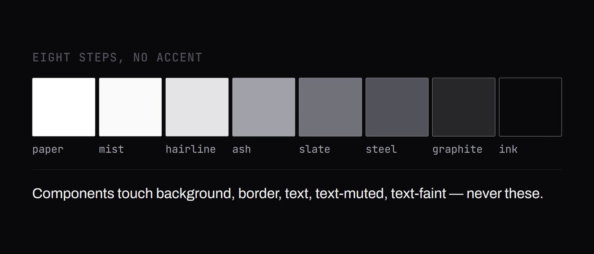
Underneath it the semantic layer: background, border, text, text muted, text faint. Components only ever touch this layer, never the raw values. The reason is immediately practical: switching from light to dark is now one change.
One rule out of it is worth stealing:
Ash is not a text colour in light mode. In dark mode it is the default text colour. Same token, opposite job.
Write sentences of that kind for your own system and you stop making contrast mistakes.
And the question of where colour appears at all has exactly one answer: syntax highlighting, the relevance bar in the search, and the status dots in the diagram. That is the complete list. Colour only shows up where real data is.
Typography: Archivo and JetBrains Mono. Archivo is a variable grotesque with a width axis — headlines run on the wide cut, body text on the normal one. One family, two widths. Which is visually exactly what I am selling: one person covering the full width.
Then Claude produced something I had not asked for: four open decisions out of my own documents, wired up as live switches. Light or dark. Achromatic or accent colour. Archivo expanded or neutral width. Twelve-column grid on or off. It had found the places where my own documents contradicted each other and turned them into toggles.
Phase 2 · Home page
Same file, second view. A hero, one line under it, a stack line in mono, two buttons.
My first correction was one sentence:
I like symmetrical design. The hero would be better symmetrical, with my
portrait centred.
After that the hero was symmetrical, portrait centred on top, and under it kicker, headline, lead and both calls to action on one axis. Everything else unchanged — and that is the part I care about.
The second correction is the one that made the page:
Now improve the UX. The sections below the hero are boring from a UX
perspective. The style and the typeface are high quality, the UX is not.
Four sections went from readable to operable:
- The architecture diagram got four nodes, keyboard operable, and a layer counter.
- The end-to-end section became a toggle: three service providers, or one person. Click it and the chain visibly breaks apart. The sales argument gets demonstrated instead of claimed.
- The four service cards expand, and the proof numbers count up on scroll — 900 milliseconds, or instantly final if reduced motion is on.
- The search got example queries as chips, with a hit count and a response time above the results.
Motion is locked down across the whole page: 120 milliseconds for a state change, 180 for a change that carries meaning, 260 on scroll-in, once per element. Ctrl + K opens the search.
The export is one file at 558 kilobytes. Runs offline, with fonts, runtime and every interaction embedded.
Phase 3 · Thumbnails
This is where it gets interesting. I still had the same chat open, and asked for something completely different:
For the following video I need a thumbnail in this style.

[the entire script of the self-hosting video]
I did not explain the style and did not reattach the brand kit. Back came three boards: 1280 × 720, ink background, Archivo at weight 700 and width 120 in caps, mono sublines, hairlines, no shadows. Signal yellow appears on exactly two things — the price badge and the arrow.
With them, three headline options and a recommendation on which to use. And an argument against one of my instincts: Nuremberg does not belong in the title or the thumbnail. The location is a detail for the description, not a reason to click.
Now the honest part: this took about fifteen rounds. Not because Claude got it wrong, but because I kept changing my mind. My actual feedback sounded like this:
I am too big. Smaller, but in colour. The arrow should point at the NetCup logo. Move the NetCup logo so Vercel and GitHub have the arrow right next to them. The gradient needs to be wider. It needs to start a few pixels further right. A little further left — and now we have the perfect graphic.
That is the workflow. It is not one prompt, it is a conversation in which you are the art director.
The three other thumbnails followed the same pattern and each cost a single paste, because the system was already in context.
Phase 4 · Banners and CV
Same chat, four more asks.
Channel banner, 2560 × 1440 — and it handled the thing everybody gets wrong: everything readable sits inside the phone safe area of 1546 × 423. The portrait and the backdrop bleed outside it on purpose, so they only show up on TV and large desktops. A switch built into the board shows all three safe zones.
LinkedIn banner, 1584 × 396. My five competencies carried over from the old banner, minus the icon set. Everything starts at x = 396, so the profile picture and name never cover anything.
CV, in the light design, four pages print-ready: white paper, the same hairline grid, Archivo caps for names and positions, JetBrains Mono for dates and section marks. Yellow only as a marker on the current row.
And then something I had not planned: I pasted the entire publishing package for the self-hosting video — seven phases, every command, all the troubleshooting — and asked for a print-ready document in the same style. Dark title page like the thumbnail, then light body text, code blocks on a mist background, running header and footer on every page, each phase starting on a new page, code blocks and tables never breaking. That is a document I would otherwise have paid somebody to lay out.
What did not work
- One thumbnail failed twice. My feedback on the first version was blunt: the arrow is hanging in the face, and the logos are neither centred nor cleanly placed. The second version put the logos on a white bar — also wrong. Three attempts, and it is still the weakest of the four.
- The gradient on the server thumbnail took about ten rounds on its own. That is not slow AI. That is what art direction looks like when you are specific.
- One check failed silently mid-session and had to be restarted.
- The point that matters if you try this yourself: at the end I asked Claude to export the whole chat. The answer was that the conversation history is not readable — what can be exported is the project: all design files, exports, uploads and assets as a zip. So the work, not the conversation. If you want your prompts documented, save them yourself as you go.
Three rules
- Front-load the input. My prompt was one sentence, the attachments were a thousand lines. That ratio is the whole trick.
- Stay in the same chat. Every thumbnail after the first cost me a single paste, because the system was already in context. The moment you open a new chat, you are explaining your brand from scratch again.
- Write down what is forbidden — not only what you want. No shadows. Radii only 2 and 4 pixels. Colour only where real data is. Constraints are what make an output specific instead of generic.
Takeaway
The sentence it comes down to: AI does not give you consistency. A design system gives you consistency. AI just applies it faster than you could.
So the actual advice is this: write your brand documents before you write a single prompt. Brand kit, design guidelines, project description. That is maybe two hours of work, and it changes every AI output you get afterwards.